By: Ivan Lukic, Ph.D. – Field Application Scientist, Partek Incorporated Let’s talk about something completely different. At Partek training events, I usually explain that our tools can be easily utilized for any quantitative data, not just genomics. For instance, last month I wrote a blog post on the analysis of gylcomics data. But actually, we go way beyond that, to some completely unrelated applications, for instance, whiskey tasting.
I was fortunate enough to stumble upon a whiskey data set (courtesy of the University of Strathclyde), which consists of the results of tasting 86 different Scotch malts. Each malt is distilled at a different site and is described by 12 taste categories (e.g. body, sweetness, smoky, and so on). The taste categories are subjective measurements obtained by referees while tasting a particular whiskey and range from zero (taste category absent) to four (taste category very strong).
Let’s explore the data by principal components analysis (Figure 1). The interpretation is analogous to the one in genomics: if two whiskeys are close on the plot, that means that they have similar values across the taste categories (to rephrase, they have a similar taste). My first observation was that there is no striking pattern (i.e., the data does not split into several well-defined clusters). That actually supports my hunch that much of whiskey tasting is merely mumbo-jumbo of connoisseurs and aficionados. You know, …with a slight touch of (insert a name of a berry that cannot be purchased at your local market or found at a specialized store because it is a highly endemic and endangered species for which you need three PhDs in botany and several decades of field experience to be able to find it in the wild). However, there is a group of several whiskeys on the left (including Lagavulin, Ardberg, and Talisker, among others) that does stand out a bit. An obvious question is – what about those? Is there something particular about their taste?
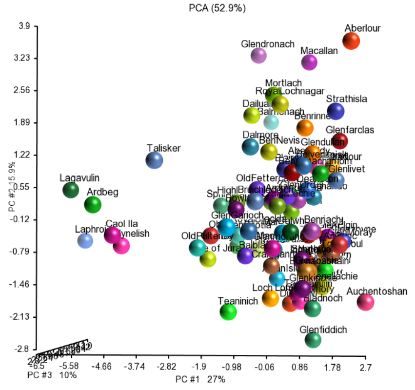
Figure 1: Principal components analysis of tasting data of 86 Scotch malt whiskeys. Each whiskey (dots) is produced by a different distillery (dots colored by the distillery and labeled) and described by 12 different taste categories.
To answer that, I turned to a Principal Components Analysis (PCA) biplot. In general, a biplot highlights the extent to which objects represented by rows of a quantitative matrix (observations) differ in terms of the objects represented by the columns (features). In this context, the PCA biplot shows the biggest patterns evident in the data in terms of how the whiskeys differ in particular taste categories. Whiskeys are shown as dots, while taste categories are presented as vectors (Figure 2; to simplify the chart, I chose 2D PCA plot).
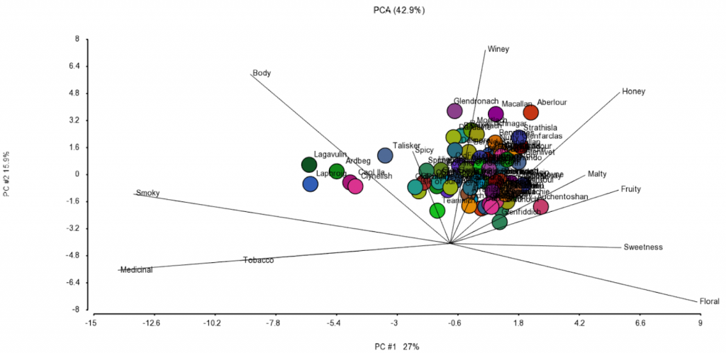
Figure 2: Principal components analysis biplot of tasting data of 86 Scotch malt whiskeys. Each whiskey (dots) is produced by a different distillery (dots colored by the distillery and labeled) and described by 12 different taste categories (lines)
Now we can tell that “body” and “smoky” should be interpreted in a similar fashion. That is, they describe very similar components of a whiskey’s flavor and are quite different from, say “fruity” and “sweetness” (which point to a different direction). That makes sense, right?
So, if I am looking for a smoky whiskey of a full-body, I should pick Lagavoulin or Laphroig (I have no idea how to pronounce that), because their points project furthest in the direction of “smoky” and “body” vectors. On the other hand, spring is in the air and to celebrate it with a sip of something with a more floral note, I should go for Amenthosan. Well, in reality, I would have neither, because I am a bourbon guy, but you get my point on biplots, right?